
Why
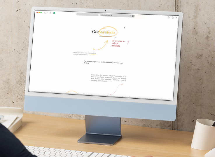
Proseterity, a brand focused on empowering individuals and organizations, required a visually appealing and intuitive manifesto page for their website. The objective was to design a page that clearly communicated the brand’s values, mission, and vision while creating an engaging user experience. The manifesto page was to serve as both an introduction to the brand and a statement of purpose, establishing a strong foundation for the website’s overall user journey.

How
The design process included:
Content Organization: Structuring the manifesto’s content in a way that is easy to follow and visually engaging, with clear sections that highlight Proseterity’s key messages.
Visual Elements: Incorporating bold imagery and typographic styles that reflected the brand’s ethos—modern, confident, and forward-thinking—while ensuring it was consistent with the overall website aesthetic.
Layout and Flow: Designing a clean, scrollable single-page layout that guided users through the manifesto in a logical sequence. This included strategic placement of headings, subheadings, and visual breaks to create a smooth and engaging experience for the viewer.
Responsive Design: Ensuring the page was fully responsive across all devices, providing an optimized user experience regardless of screen size.
What
The final page features:
Manifesto Statement: A clear, impactful introduction to Proseterity’s core values and mission, effectively conveying the brand’s purpose and vision.
Visual Design: The use of vibrant imagery, bold typography, and dynamic visuals that enhance the written content, creating a visually cohesive and appealing experience.
User-Centered Design: Interactive elements and smooth scrolling that engage users, keeping them focused on the content and encouraging them to explore further.


